오늘은 테두리를 둥글게 만드는 속성인 border-radius에 대해서 알아 보겠습니다.
- border radius란?
테두리를 둥글게 만드는 css 속성값으로, 총 8개의 속성값을 넣어야 하지만 값이 같다면 짧게
쓸 수 있습니다.
/*기본 문법*/
border-radius: top-left-x top-right-x bottom-right-x bottom-left-x /
top-left-y top-right-y bottom-right-y bottom-left-y
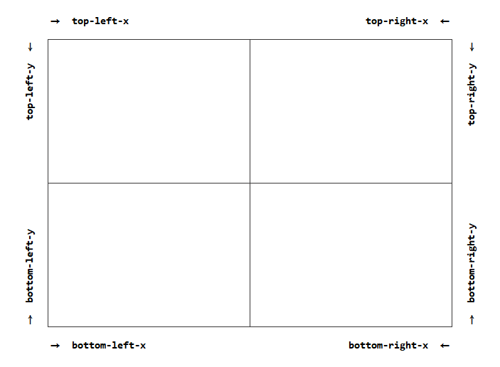
각각의 속성값들은 해당 그림처럼 적용이 됩니다.
(속성값으로는 px, %와 같이 길이 단위를 넣습니다.)
그럼 개념은 이 정도로 하고, 예제 코드로 알아 보겠습니다.
- 예제 코드
<!DOCTYPE html>
<html lang="en" dir="ltr">
  <head>
    <meta charset="utf-8">
    <title>exhtml</title>
    <style type="text/css">
      div {
        width: 300px;
        height: 300px;
        background-color: black;
        margin: 100px;

      }
    </style>
  </head>
  <body>
    <div>
    </div>
  </body>
</html>

이 코드를 기본으로 여러 border-radius값을 줘 보도록 하겠습니다.
1. 모든 방향의 값이 다를 때
모든 방향에 다른 값을 줬을 때 어떻게 쓰는지 보겠습니다.
<!DOCTYPE html>
<html lang="en" dir="ltr">
  <head>
    <meta charset="utf-8">
    <title>exhtml</title>
    <style type="text/css">
      div {
        width: 300px;
        height: 300px;
        background-color: black;
        margin: 100px;
        border-radius: 40px 100px 75px 95px / 80px 105px 90px 10px;
      }
    </style>
  </head>
  <body>
    <div>
    </div>
  </body>
</html>
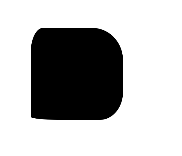
위의 x, y축값이 어디로 어떻게 들어갔는지 생각하면서 결과창을 보시면 우리가 준 px값만큼 해당 위치에
들어간 것을 볼 수 있습니다.
2. 대각선 방향의 값이 같을 때
대각선 방향의 값이 같으면 이와 같이 값을 줄일 수 있습니다.
border-radius: aa bb / cc dd (=border-radius: aa bb aa bb / cc dd cc dd)
<!DOCTYPE html>
<html lang="en" dir="ltr">
  <head>
    <meta charset="utf-8">
    <title>exhtml</title>
    <style type="text/css">
      div {
        width: 300px;
        height: 300px;
        background-color: black;
        margin: 100px;
        border-radius: 50px 100px / 150px 200px;
      }
    </style>
  </head>
  <body>
    <div>
    </div>
  </body>
</html>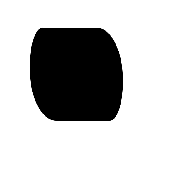
보시면 대각선 방향끼리 값이 같은 것을 볼 수 있습니다.
3. x축, y축 네 곳이 모두 같을 때
border-radius: aa / bb (=border-radius: aa aa aa aa / bb bb bb bb)
위 코드와 같이 x축, y축끼리 같은 값일 때 코드를 줄여 쓸 수 있습니다.
예제에 한 번 적용시켜 보겠습니다.
<!DOCTYPE html>
<html lang="en" dir="ltr">
  <head>
    <meta charset="utf-8">
    <title>exhtml</title>
    <style type="text/css">
      div {
        width: 300px;
        height: 300px;
        background-color: black;
        margin: 100px;
        border-radius: 100px / 200px;
      }
    </style>
  </head>
  <body>
    <div>
    </div>
  </body>
</html>

보시다싶이 네 방향의 값이 같게 나오는 것을 볼 수 있습니다.
4. x축, y축의 가로와 세로 방향값이 같을 때
border-radius: aa bb cc dd (=border-radius: aa bb cc dd / aa bb cc dd)
위 코드와 같이 가로, 세로 방향의 x축, y축 값이 같다면 / 기호를 쓰지 않고 줄여서 쓸 수 있습니다.
<!DOCTYPE html>
<html lang="en" dir="ltr">
  <head>
    <meta charset="utf-8">
    <title>exhtml</title>
    <style type="text/css">
      div {
        width: 300px;
        height: 300px;
        background-color: black;
        margin: 100px;
        border-radius: 100px 150px 130px 200px;
      }
    </style>
  </head>
  <body>
    <div>
    </div>
  </body>
</html>
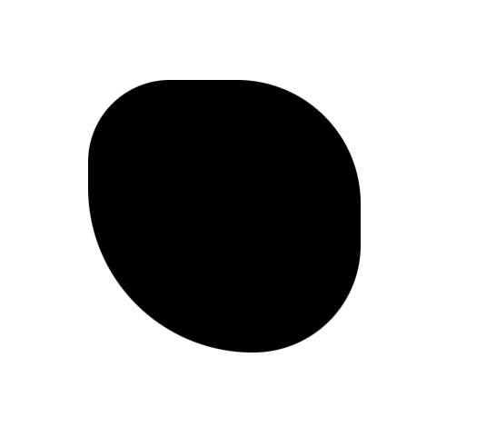
5. x축, y축의 가로와 세로의 대각선 방향값이 같을 때
border-radius: aa bb (=border-radius: aa bb aa bb / aa bb aa bb)
예제로 한 번 보겠습니다.
<!DOCTYPE html>
<html lang="en" dir="ltr">
  <head>
    <meta charset="utf-8">
    <title>exhtml</title>
    <style type="text/css">
      div {
        width: 300px;
        height: 300px;
        background-color: black;
        margin: 100px;
        border-radius: 200px 100px;
      }
    </style>
  </head>
  <body>
    <div>
    </div>
  </body>
</html>

6. 모든 방향의 값이 같을 때
border-radius: aa (=border-radius: aa aa aa aa / aa aa aa aa)
위와 같이 코드를 사용합니다.
<!DOCTYPE html>
<html lang="en" dir="ltr">
  <head>
    <meta charset="utf-8">
    <title>exhtml</title>
    <style type="text/css">
      div {
        width: 300px;
        height: 300px;
        background-color: black;
        margin: 100px;
        border-radius: 200px;
      }
    </style>
  </head>
  <body>
    <div>
    </div>
  </body>
</html>

모든 방향에 200px의 값이 들어가 거의 원 모양처럼 나오는 것을 볼 수 있습니다.
+
마지막으로, 각 위치를 가리키는 속성이 따로 있는데 이것에 대해서 다루고 마무리 짓도록 하겠습니다.
border-top-left-radius: 100px 150px;
border-top-right-radius: 200px 300px;
border-bottom-right-radius: 50px 70px;
border-bottom-left-radius: 20px 15px;

= border-radius: 100px 200px 50px 20px / 150px 300px 70px 15px;
이렇게 각 x축, y축값을 따로 지정해 줄 수 있습니다.
저기서 값을 하나만 쓰면 해당 방향의 x축, y축 값이 같다는 뜻이 됩니다.
border-top-left-radius: 100px;
border-top-right-radius: 200px;
border-bottom-right-radius: 50px;
border-bottom-left-radius: 20px;

= border-radius: 100px 200px 50px 20px / 100px 200px 50px 20px;
= border-radius: 100px 200px 50px 20px;
'웹 개발 > 주요 태그, 속성들' 카테고리의 다른 글
| css text-overflow 속성 (0) | 2021.12.27 |
|---|---|
| css white-space 속성 (0) | 2021.12.26 |
| css text-indent 속성 (0) | 2021.12.26 |
| css text-align 속성 (0) | 2021.12.23 |
| css z-index 속성 (0) | 2021.12.23 |


댓글